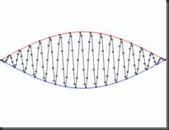
Six ways to see two curves
A simple animation has been found to offer our brains many possible interpretations. Jan Kremláček from Charles University in Hradec Králové, Czech Republic, discovered six different ways of perceiving a moving sine graph drawn with dots. The curves often seem to undulate like two ribbons, but the animation can also seem to have depth, with one curve seeming to be further back than the other. The dotted arcs can also look like a spindle shape that revolves and snakes along.
If you keep staring, the curves can seem to revolve vertically around a static rod, first in one direction, then the other. The animation can also look like a series of bouncing dots, but this is very hard to perceive without overlaying vertical bars on top of it. "Our brain is able to reconstruct different learned interpretations, but only one can be perceived at a time," says Kremláček. He came across the illusion by chance while preparing graphs for a lecture in signal processing.
See it: Click here to see the illusion (requires Flash)
Impossible motion
A gravity-defying illusion has won the 2010 Best Illusion of the Year Contest, held yesterday in Naples, Florida.
The visual trick involves a 3D construction of four slopes that appear to extend downwards away from a common centre (see video). When wooden balls are placed on the slopes, however, they bizarrely roll upwards as if a magnet is pulling them.
But the "Impossible Motion" illusion, created by Kokichi Sugihara of the Meiji Institute for Advanced Study of Mathematical Sciences in Kawasaki, Japan, is soon dispelled when it's viewed from a different perspective – each slope is actually sloping downwards towards a common centre.
We're fooled because we make the assumption that each supporting column of the object is vertical, and that the longest column in the centre is the highest. But in reality, the columns and slopes are angled to create the illusion.
Illusion-defying contours
An animation that appears to have illusory contours was awarded second place in the contest. Created by Bart Anderson at the University of Sydney, Australia, it's made up of four circles and four dots that move back and forth over the outline of a rectangle. Contours connecting the moving dots in the middle seem to appear, creating a diamond that sometimes seems to morph into a more rounded shape as it stretches out.
Contours appear in many illusions. They can normally be explained by the way fragments of objects are arranged: a well-known shape without visible contours is inferred because our brains choose the most likely configuration based on the visual information.
But this explanation doesn't seem to apply to Anderson's illusion. The moving circles and dots are never partially obscured, so the brain shouldn't have to infer another shape. "This illusion can't be understood with any known mechanism that has been proposed to explain the formation of illusory contours," says Anderson.
The steerable spiral
This spiral animation makes you think dots are moving in the opposite direction to reality. Initially the dots move in an anticlockwise spiral towards the centre of the screen. But as they get closer to each other, they appear to move in the opposite direction.
The illusion was created by Peter Meilstrup and Michael Shadlen of the University of Washington in Seattle. It fools us because each dot contains a grating that moves in the opposite direction to the true direction of the dots. When viewed individually, it's easy to see the real direction of each dot – it's only when they get close together that the grating takes effect and alters the perceived direction of motion
Stretching out in the tub
One of this year's finalists was a shrinking and stretching bathtub. It's an illusion that Lydia Maniatis of the American University in Washington DC noticed whilst walking past a large billboard poster (see video). But how can walking past a picture of a bathtub make its dimensions change?
The effect occurs because we naturally perceive the tub in the poster as a 3D object, but the still image in the poster happened to be photographed from an oblique angle. This means that the tub's orientation relative to the viewer changes depending on the viewing angle. So by walking from one end of the image to the other, the viewer experiences a series of different retinal images of the tub, which makes the tub look smaller from the right but larger from the left.
Non-glossy gloss
When photographic prints are given a matt or glossy finish, it's all down to the photo paper's reflectance. But now Maarten Wijntjes and Sylvia Pont fromDelft University of Technology in the Netherlands have managed to make a digital image look glossy without changing its reflectance.. They used an image from the computer model of a fractal that had a matt finish. When the depth value in the model was changed, as well as the direction of light hitting it, the 2D surface looked like it had a glossy finish.
"A possible explanation is that highlights are created where you would normally expect them to be if the surface was glossy," says Wijntjes.


No comments:
Post a Comment